Spreadsheets are the backbone of data-driven decisions, but Excel can feel like a maze. Whether you’re battling VLOOKUP errors, untangling nested IF statements, or spending hours formatting pivot tables only to find they don’t show what you need, traditional Excel analysis can be daunting. For many, diving into data feels less like uncovering insights and more like solving a cryptic puzzle.
What if you could analyze your spreadsheets without writing a single formula or line of code? What if you could ask questions in plain English and get answers—complete with charts and summaries—in seconds?
Meet Excelmatic, an AI-powered platform that redefines spreadsheet analysis. Designed for everyone from small business owners to students, Excelmatic lets you upload your data, ask questions naturally, and receive polished insights instantly. No Excel expertise required. No coding skills needed. Just clarity and results.
In this guide, we’ll explore why Excel’s complexity can be a barrier, how Excelmatic eliminates that frustration, and how anyone can use it to turn raw data into smart decisions. Whether you’re analyzing sales, budgets, surveys, or marketing campaigns, Excelmatic makes data analysis approachable, fast, and dare we say—enjoyable.
The Problem: Excel’s Complexity Blocks Insights
Excel is a powerhouse, but its learning curve can feel like climbing a mountain. Let’s say you’re working with a spreadsheet containing six months of sales data, structured like this:
| Region | Month | Revenue | Returns (%) | Ad Spend | Profit Margin (%) |
|---|---|---|---|---|---|
| North America | Jan | 12,000 | 4.2 | 3,500 | 15.5 |
| Europe | Jan | 9,400 | 3.8 | 2,800 | 12.3 |
| Asia | Jan | 10,200 | 5.0 | 2,900 | 14.0 |
| ... | ... | ... | ... | ... | ... |
You need answers to questions like:
- Which region had the highest average profit margin over six months?
- How did return rates trend month by month, and were there any outliers?
- Can you show revenue versus ad spend in a scatter plot to spot correlations?
- Which months had above-average sales in Europe?
In traditional Excel, tackling these questions is a multi-step ordeal:
- Profit Margin Analysis: You’d write an
AVERAGEIFSformula to calculate averages by region, assuming you nail the syntax and avoid referencing empty cells. A misplaced comma or incorrect range could derail your results. - Return Rate Trends: You’d build a pivot table, group by month, calculate averages, and create a line chart. One wrong setting—like forgetting to exclude null values—could skew your trend.
- Revenue vs. Ad Spend: You’d manually select data, insert a scatter plot, adjust axes, add trendlines, and format labels to make it presentable. Misselect a range, and your chart is nonsense.
- Regional Sales Filter: You’d use filters or
IFformulas to isolate Europe’s data, then applyAVERAGEand compare month by month—a tedious process prone to human error.
Each task demands familiarity with Excel’s quirks, from function syntax to chart formatting. Errors creep in easily: a typo in a formula, a misconfigured pivot table, or a hidden row can throw everything off. For non-experts, this is overwhelming. Even seasoned users waste hours troubleshooting instead of analyzing.
The bigger issue? Data analysis should empower, not frustrate. Excel’s complexity often creates a wall between your data and the insights you need, especially if you’re not a spreadsheet wizard.
The Excelmatic Solution: AI-Powered Simplicity
Excelmatic tears down that wall by making data analysis as intuitive as a conversation. Powered by advanced AI, it understands natural language, interprets your intent, and delivers results without requiring you to touch a formula or pivot table. Here’s how it works in three seamless steps:
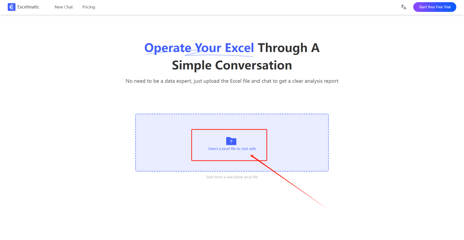
1. Upload Your Spreadsheet
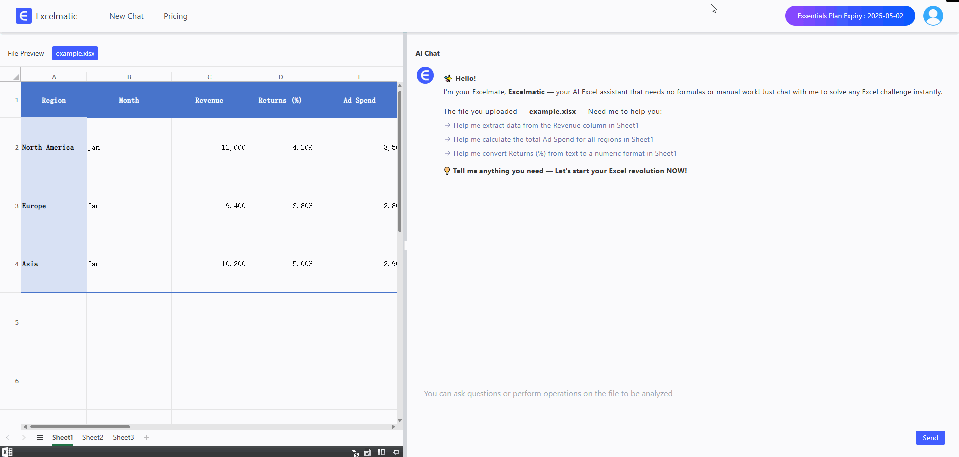
Excelmatic supports standard Excel formats (.xlsx, .xls), CSV files, and even Google Sheets exports. Whether your dataset has 10 rows or 10,000, just drag and drop your file into the platform. The AI quickly scans your data, recognizing column headers, data types (numbers, percentages, dates), and relationships between fields.
Drag and drop your Excel file to start analyzing instantly.
2. Ask Questions in Plain English
Forget memorizing functions like SUMIFS or INDEX-MATCH. Type questions as you’d ask a colleague:
- “Show me a bar chart of revenue by region for Q1.”
- “What’s the average return rate by month, and highlight any months above 5%?”
- “Compare ad spend to profit margin in a scatter plot.”
- “Which product category had the highest sales in March?”
- “Is there a correlation between ad spend and revenue?”
Excelmatic’s AI parses your question, identifies the relevant data, and determines the best way to respond—whether it’s a calculation, a visualization, or a written explanation. It even handles vague or complex requests by inferring your intent, so you don’t need to phrase things perfectly.
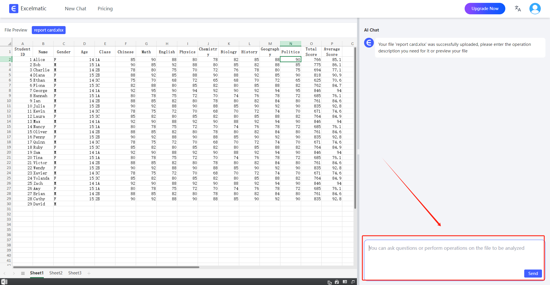
Type your question naturally, and let Excelmatic handle the rest.
3. Get Insights and Visuals Instantly
Within seconds, Excelmatic delivers:
- Visualizations: Bar charts, line graphs, pie charts, scatter plots, heatmaps, and more, all automatically formatted for clarity and impact. Charts include labeled axes, legends, and color schemes optimized for readability.
- Summaries: Plain-language explanations of the results, so you don’t need to interpret raw numbers. For example, “Asia led in revenue for February with $11,000, a 7.8% increase from January.”
- Calculations: Accurate metrics like averages, totals, trends, or percentages, computed flawlessly without manual formulas.
No pivot tables to configure. No chart wizards to navigate. No error messages to debug. Just polished, presentation-ready results.
Real-World Example: From Data to Decisions in Under a Minute
Let’s see Excelmatic in action with a practical scenario. You’re a small business owner analyzing the sales dataset shown earlier, extended to include February:
| Region | Month | Revenue | Returns (%) | Ad Spend | Profit Margin (%) |
|---|---|---|---|---|---|
| North America | Jan | 12,000 | 4.2 | 3,500 | 15.5 |
| Europe | Jan | 9,400 | 3.8 | 2,800 | 12.3 |
| Asia | Jan | 10,200 | 5.0 | 2,900 | 14.0 |
| North America | Feb | 13,500 | 4.5 | 4,000 | 16.2 |
| Europe | Feb | 8,900 | 4.0 | 2,500 | 11.8 |
| Asia | Feb | 11,000 | 5.2 | 3,200 | 14.8 |
You upload the file to Excelmatic and ask:
Which region had the highest revenue in January? Also, create a pie chart of January revenue by region.
Excelmatic’s response:
Excelmatic generates a professional pie chart in seconds, no manual formatting needed.
Who Can Benefit from Excelmatic?
Excelmatic is a game-changer for anyone who works with data but dreads Excel’s complexity. Here’s how different users can leverage it:
- Small Business Owners: Generate sales reports, track expenses, or analyze customer trends without hiring a data analyst. Example: “What’s my best-selling product this quarter, and how does it compare to last year?”
- Teachers and Students: Summarize research data or create visuals for assignments. Example: “Show a histogram of survey responses about study habits, grouped by age.”
- Accountants and Financial Analysts: Simplify budget reviews, expense tracking, or forecasting. Example: “Compare monthly overhead costs and flag increases above 10%.”
- Marketers: Evaluate campaign performance, A/B tests, or customer acquisition metrics. Example: “Which email subject line had the highest open rate, and how did it impact conversions?”
- HR Professionals: Analyze employee performance, survey feedback, or hiring trends. Example: “Show a chart of employee satisfaction scores by department.”
- Non-Technical Professionals: Anyone needing insights without Excel skills. Example: “Summarize my team’s project hours by task category.”
Even data-savvy users benefit, as Excelmatic automates repetitive tasks, freeing them to focus on strategy rather than syntax.
Why Excelmatic Beats Traditional Excel
To appreciate Excelmatic’s value, let’s compare it to traditional Excel for a common task: analyzing sales trends.
| Aspect | Traditional Excel | Excelmatic |
|---|---|---|
| Setup Time | 10–30 minutes to write formulas, build pivot tables, and format charts. | Seconds to upload a file and ask a question. |
| Skill Level | Requires knowledge of formulas (e.g., VLOOKUP, AVERAGEIFS), pivot tables, and chart tools. |
No skills needed—just plain English. |
| Error Risk | High: Typos, wrong ranges, or hidden data can skew results. | Low: AI validates data and calculations. |
| Output Quality | Manual formatting needed for professional charts and summaries. | Polished, presentation-ready visuals and text. |
| Flexibility | Limited to pre-built functions; complex queries may require VBA. | Handles diverse questions, from trends to correlations. |
| Learning Curve | Steep, with ongoing need to learn new features. | None—intuitive for all users. |
Excelmatic doesn’t replace Excel; it enhances it by removing barriers and accelerating insights. Think of it as a brilliant assistant who does the heavy lifting while you focus on decisions.
Troubleshooting Tips: Getting the Most from Excelmatic
While Excelmatic is user-friendly, here are tips to optimize your experience:
- Be Specific: Vague questions like “Show me sales” may yield broad results. Try “Show monthly sales by region as a line chart” for precision.
- Check Data Quality: Ensure your spreadsheet has clear column headers (e.g., “Revenue” instead of “Col1”) and consistent formats (e.g., all dates as MM/DD/YYYY).
- Iterate Freely: If the first chart isn’t perfect, refine your question. For example, follow “Show revenue by month” with “Add profit margin to the same chart.”
- Use Filters: For large datasets, narrow your focus with questions like, “Show sales for 2025 only” to avoid overwhelming outputs.
- Explore Advanced Queries: Don’t shy away from complex requests like, “Predict next month’s revenue based on current trends.” Excelmatic’s AI can handle forecasting with surprising accuracy.
If you hit a snag, Excelmatic’s help center offers tutorials, and its AI can suggest rephrased questions to clarify your intent.
Try It Yourself: A 5-Minute Challenge
Ready to experience the magic? Take one of your own spreadsheets—sales data, a personal budget, survey results, or even a fantasy football roster—and upload it to Excelmatic.
Try these questions to spark ideas:
- “What’s the trend of my expenses over the last six months?”
- “Show a pie chart of my budget by category.”
- “Which customers had the highest purchases in Q1?”
- “Is there a pattern in my website traffic by day of the week?”
In minutes, you’ll have charts, summaries, and insights—no formulas, no fuss. You might even discover patterns you hadn’t noticed before.
Final Thoughts: Data Analysis for Everyone
Data shouldn’t be a source of stress. You don’t need to be a data scientist, coder, or Excel expert to make sense of your spreadsheets. With the right tool, anyone can turn numbers into stories, decisions, and opportunities.
Excelmatic empowers you to analyze data with confidence, whether you’re running a business, teaching a class, or managing a personal project. It’s not about replacing Excel—it’s about making Excel work for you, without the headaches.
Say goodbye to formula errors, pivot table woes, and wasted hours. Say hello to clarity, speed, and insights that matter.
Start your no-code data journey today at Excelmatic.