If you work in e-commerce, operations, or reporting, you know the pain of starting each month with this dreaded routine:
Clean up messy order data, copy/paste from multiple sources, create pivot tables, write formulas, build charts, and answer endless questions from your boss.
But what if you could do all of that with just one sentence?
In this post, we’ll show you how to use Excelmatic, an AI-powered Excel assistant, to summarize monthly order data and create reports in seconds—no formulas, no pivot tables, no templates.
The Real-World Scenario: Messy Monthly Order Data
Here’s what raw order data usually looks like:
| Order ID | City | Date | Channel | SKU | Qty | Unit Price | Amount |
|---|---|---|---|---|---|---|---|
| A001 | Beijing | 2025-04-01 | Tmall | CASE01 | 2 | 35 | 70 |
| A002 | Shanghai | 2025-04-01 | JD.com | CASE01 | 1 | 35 | 35 |
| A003 | Shenzhen | 2025-04-02 | TikTok | BT001 | 1 | 79 | 79 |
| A004 | Shanghai | 2025-04-03 | JD.com | BT001 | 2 | 79 | 158 |
| A005 | Beijing | 2025-04-03 | DTC | PB002 | 1 | 129 | 129 |
You want to answer common questions like:
- Total number of orders
- Total sales amount
- Breakdown by city or channel
- Best-selling SKUs
Traditional Excel Method: Manual & Time-Consuming
To get your report, you would typically:
- Add new columns (like
Amount = Qty × Unit Price) - Build pivot tables for city or channel breakdowns
- Create charts manually
- Write your own summaries (like
Beijing had the most orders at 38%)
It’s doable—but it’s slow and painful.
The AI Way: One Sentence, Full Report
Open Excelmatic
Upload your Excel or CSV file. Then ask:
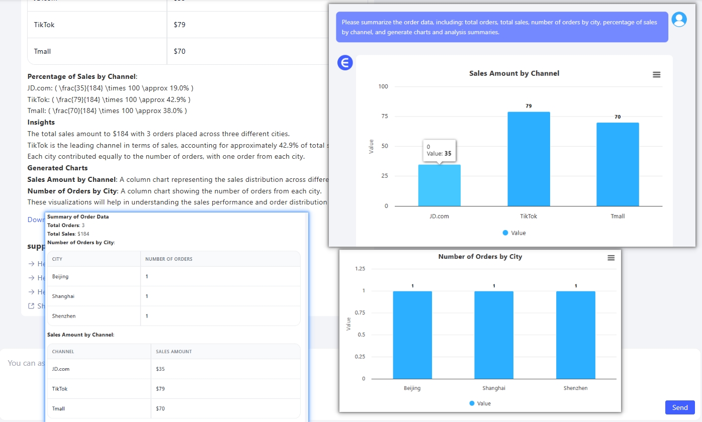
Summarize order data, including total orders, total sales, city-level breakdown, channel sales distribution, and generate charts and a summary.
Excelmatic will:
- Auto-calculate totals
- Group by city and channel
- Generate clean bar & pie charts
- Provide a text summary like:
Example Output with Excelmatic
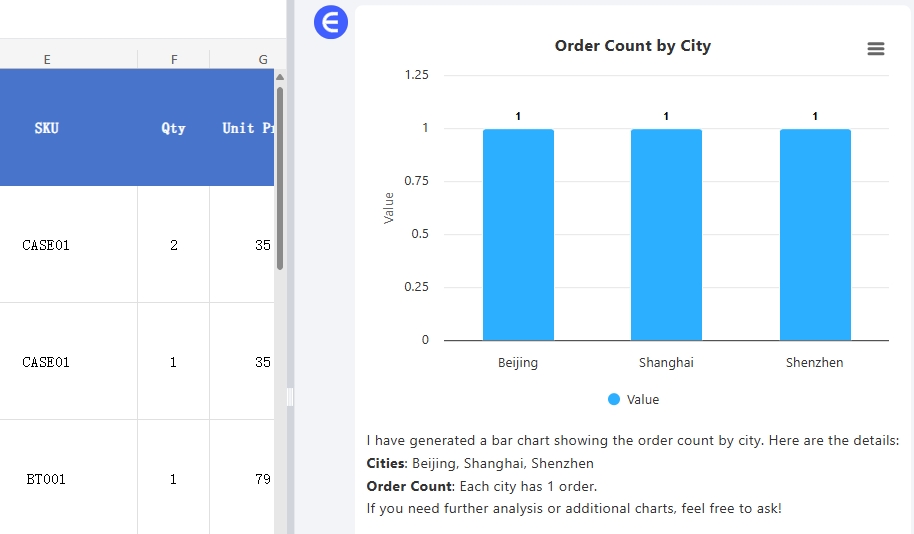
Bar Chart: Orders by City
AI automatically groups the data and generates a visual bar chart comparing cities.
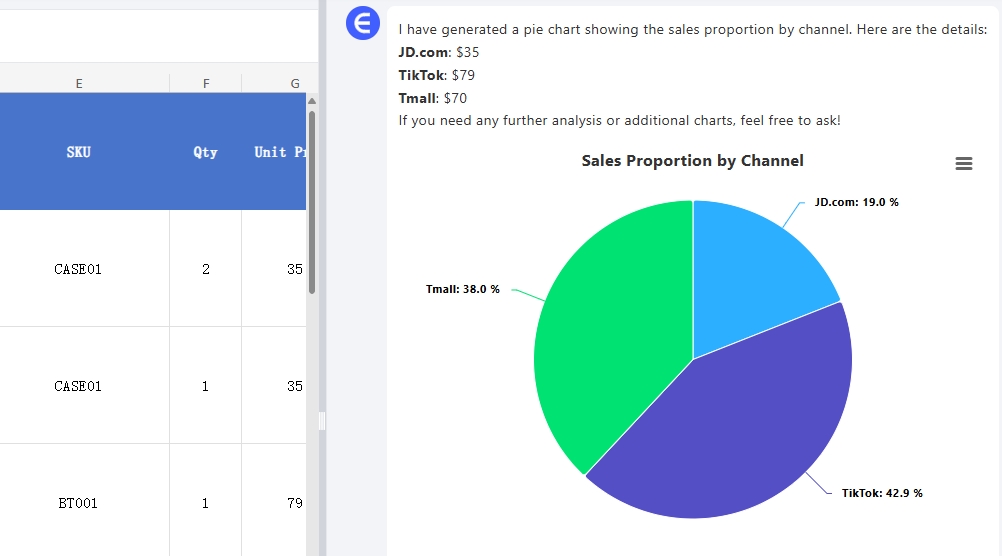
Pie Chart: Channel Distribution
Shows the sales breakdown by platform (e.g., Tmall, JD, TikTok, DTC).
Natural Language Summary
Example:
The total sales amount to $184 with 3 orders placed across three different cities.
TikTok is the leading channel in terms of sales, accounting for approximately 42.9% of total sales.
Each city contributed equally to the number of orders, with one order from each city.
Follow-Up Prompts You Can Ask
After the initial summary, you can ask:
- What were the top 5 best-selling SKUs this month?
- Show daily revenue trend in a line chart.
- Which city had the highest average order value?
- Compare channel performance across SKUs.
Excelmatic understands your follow-ups and generates new visuals and insights instantly.
Why Excelmatic Saves You Time
| Task | Excel Manual Workflow | Excel AI |
|---|---|---|
| Monthly summary | Formulas + pivots | One sentence |
| Grouping by city/channel | Manual pivot table setup | Auto-grouped |
| Visual charts | Insert + format manually | Auto-generated |
| Written insights | Write it yourself | AI-generated summary |
| Ad-hoc follow-up analysis | Rebuild filters | Ask a new question |
Conclusion: Let AI Handle Your Monthly Reports
Don't waste another morning building monthly Excel reports manually.
Upload your spreadsheet to Excelmatic and ask:
Create a full summary of this month's order data with charts and a written analysis.
You’ll get:
- Clean summary tables
- Professional bar, line, and pie charts
- Written business insights in seconds
Try Excelmatic Free now! – Generate your order analysis report with one click