Creating charts in Excel used to mean fiddling with data ranges, formatting axes, and spending too much time figuring out which chart to use. Not anymore.
Excelmatic lets you generate beautiful and insightful charts from your spreadsheet data by simply asking in natural language. No formulas, no drag-and-drop. Just upload, chat, and visualize.
In this post, we’ll walk through 5 real-world chart examples—bar charts, pie charts, and line charts—that you can create using Excelmatic in just a few clicks. Plus, we'll show how the AI doesn’t just draw the chart, it interprets it for you too.
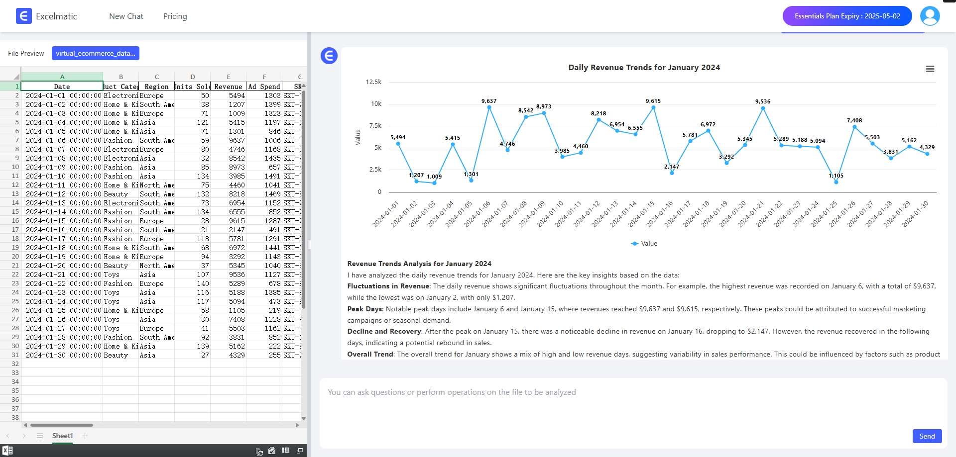
1. Sales Trend Over Time (Line Chart)
Use Case: The business team would like to know the sales performance for a particular month.
Ask Excelmatic:
Output a line graph of daily income for January.
What You Get:
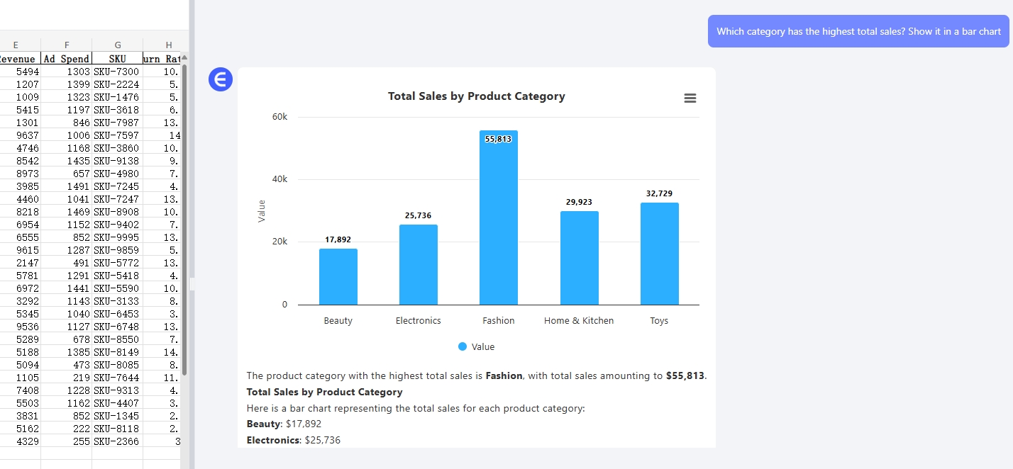
2. Product Category Comparison (Bar Chart)
Use Case: An Amazon seller wants to compare total revenue by product category.
Ask Excelmatic:Which category has the highest total sales? Show it in a bar chart.
What You Get:
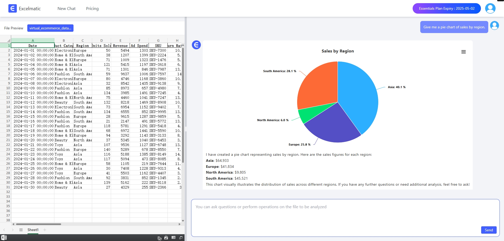
3. Regional Sales Distribution (Pie Chart)
Use Case: A marketing manager wants to see how sales are spread across regions.
Ask Excelmatic:
Give me a pie chart of sales by region.
What You Get:
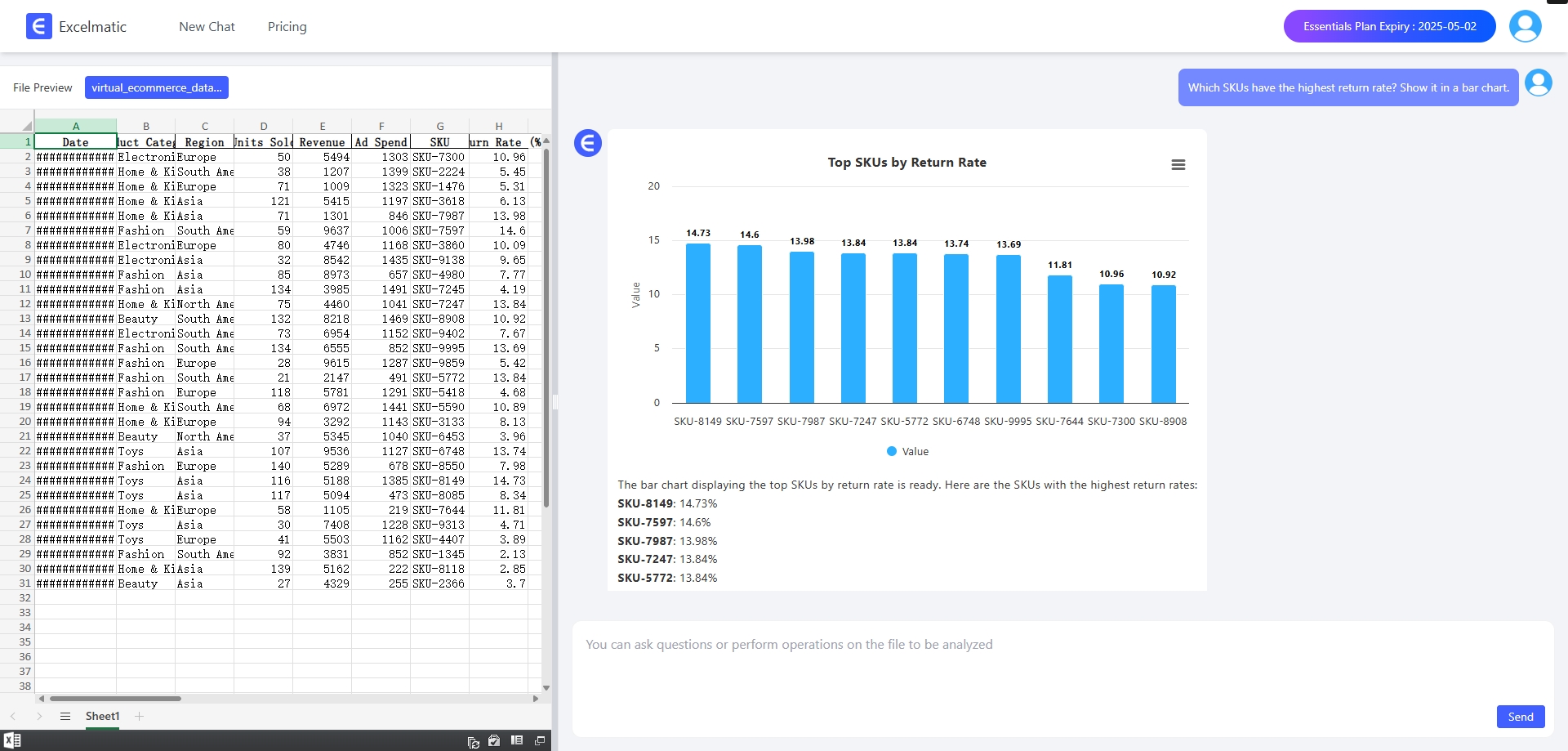
4. Return Rate by SKU (Bar Chart)
Use Case: A quality control team wants to visualize which products are being returned the most.
Ask Excelmatic:
Which SKUs have the highest return rate? Show it in a bar chart.
What You Get:
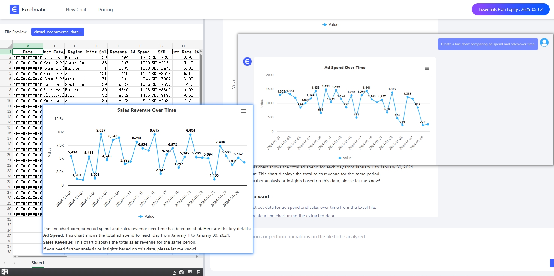
5. Daily Ad Spend vs Sales (Line Chart)
Use Case: A digital marketer wants to compare how ad spend relates to sales over time.
Ask Excelmatic:
Create a line chart comparing ad spend and sales over time.
What You Get:
Why It Matters
Excelmatic is not just making charts—it’s helping you understand what your charts mean.
Whether you're a business analyst, e-commerce seller, or just trying to make sense of your data, these chart types—bar charts, pie charts, and line charts—cover 90% of typical reporting needs.
And the best part? You don’t have to write a single formula or drag a single cell.
Final Thoughts
Data visualization shouldn't be a chore. With Excelmatic, it’s fast, simple, and smart.
Upload your spreadsheet. Ask a question. Get a chart—and an explanation.
Try Excelmatic today and turn raw data into real insight.